Betabrand
Let them have pants
client
Betabrand
role
UX / Product Designer
Wins
+22.34% add-to-cart
+7.76% multi-item conversions
+$9 average order value
Overview
Betabrand is a social e-commerce platform where customers help design apparel through voting and crowdfunding. In 2019, one product — Dress Pant Yoga Pants (DPYPs) — accounted for 83% of the company’s $88M annual revenue.
The company’s new priority became clear: optimize the platform around DPYPs. My role as Product Designer and UX Stakeholder was to lead a redesign of the DPYP collection experience.
How do we optimize the platform around this hero product while improving discoverability, expand variety, and increase customer lifetime value (LTV)?
Challenge
The DPYP collection page displayed only a fraction of the available products. Features customers actively requested — like pockets — were buried and hard to find. Most ad traffic bypassed the collection entirely, dropping users onto individual product detail pages (PDPs), which led to:
- Poor discoverability of the full product line.
- Disrupted flows as customers switched styles mid-journey.
- Low LTV: repeat buyers often repurchased the same product they first converted on.
Was this a discoverability issue, or did customers only want a limited subset of offerings?
Community data (crowdsourcing votes, feature requests) showed customers wanted much greater variety than the site revealed.
Objective
Redesign the DPYP collection experience to:
- Surface the entire product line (+60 styles).
- Improve navigation and product discovery.
- Increase LTV by encouraging variety and repeat purchases.
My Role
As the Product Designer and UX Stakeholder, I led a cross-functional team of five (creative director, marketing manager, merchandising manager, sr. engineering, retail manager). My contributions included:
- Facilitating design workshops to align on goals, pain points, and KPIs.
- Leading user research, participated in diary studies, refreshed user persona, analyzed community data.
- Designing wireframes, prototypes, and final UI.
- Defining new KPIs beyond conversion, focusing on discoverability and multi-item purchases.
- Partnering closely with engineering, including QA, A/B testing setup.
- Conducting user research & analyzing community data.
Results
The redesign delivered measurable business impact:
- +22.34% increase in add-to-cart rate.
- +7.76% lift in multi-item conversions.
- +$9 increase in average order value (AOV).
- +1.8% increase in revenue events.
Beyond conversions, the project expanded the customer base, increased LTV, and made advertising more efficient by driving higher-value, more varied purchases.
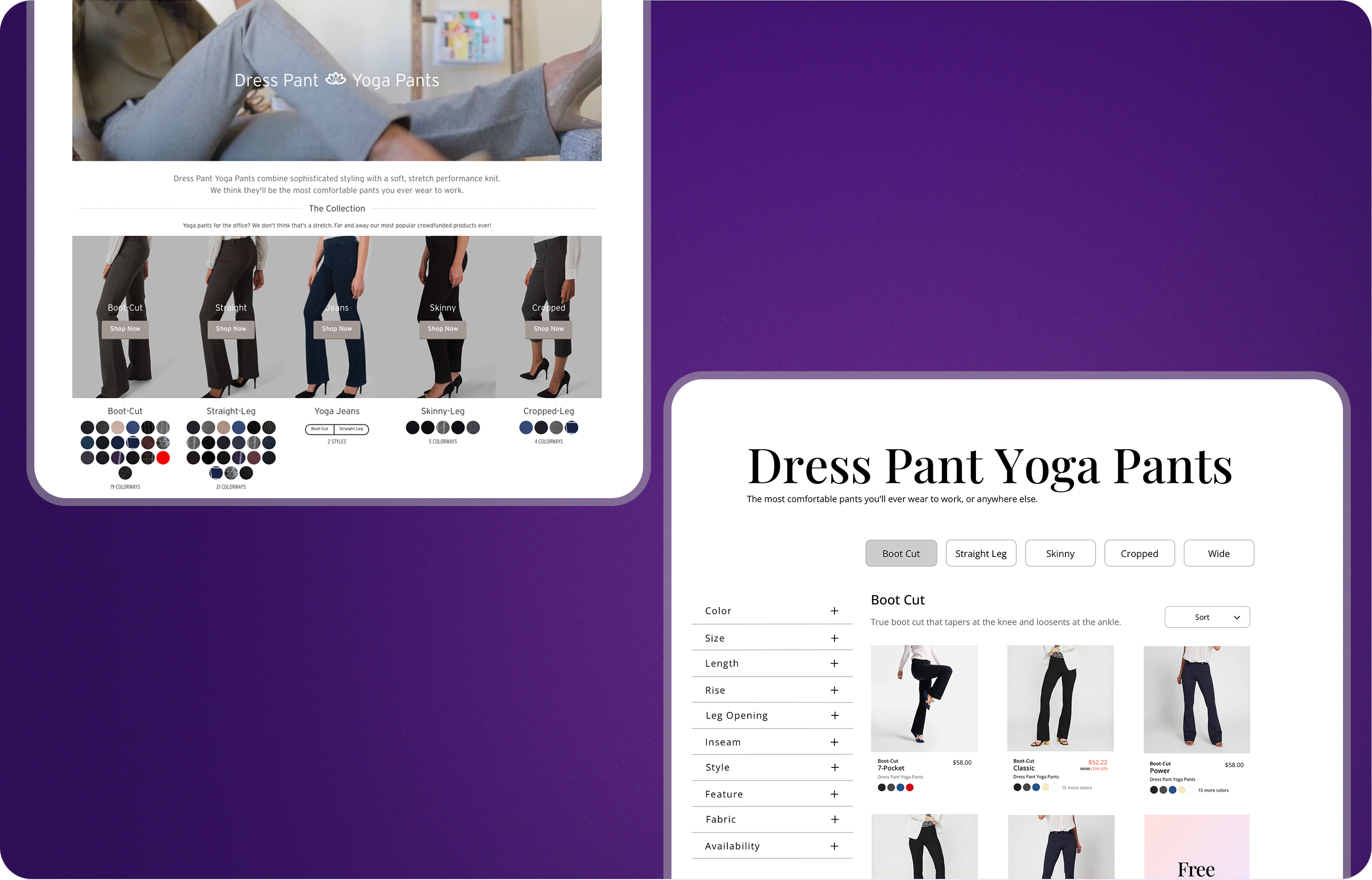
Before & After
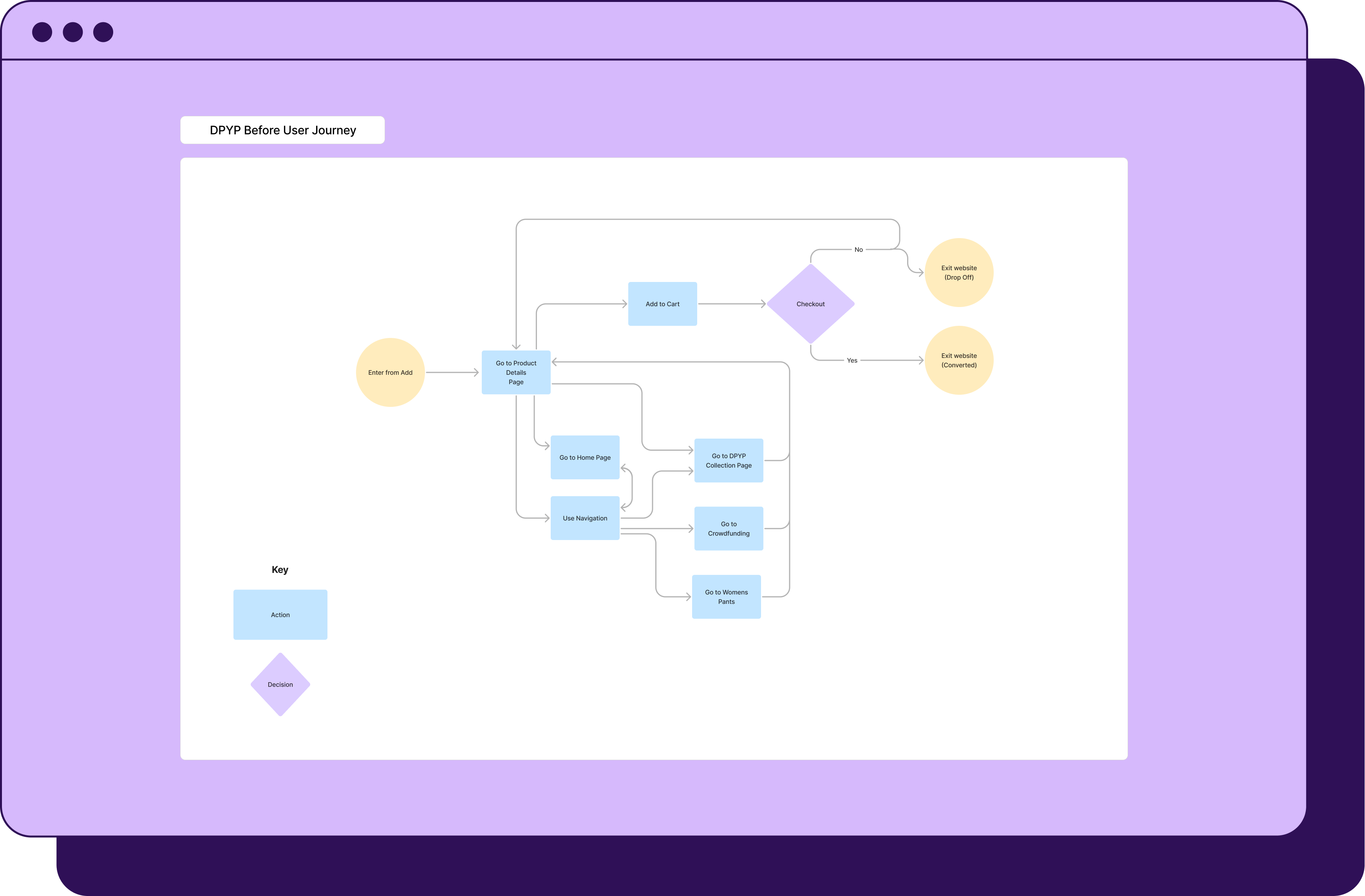
Typical user journey from an advertisement landing on a Product Detail Page; most of Betabrand’s ad traffic was sent directly to the PDPs. This was not optimal because it bypassed the complete collection offering having a negative impact on discoverability.
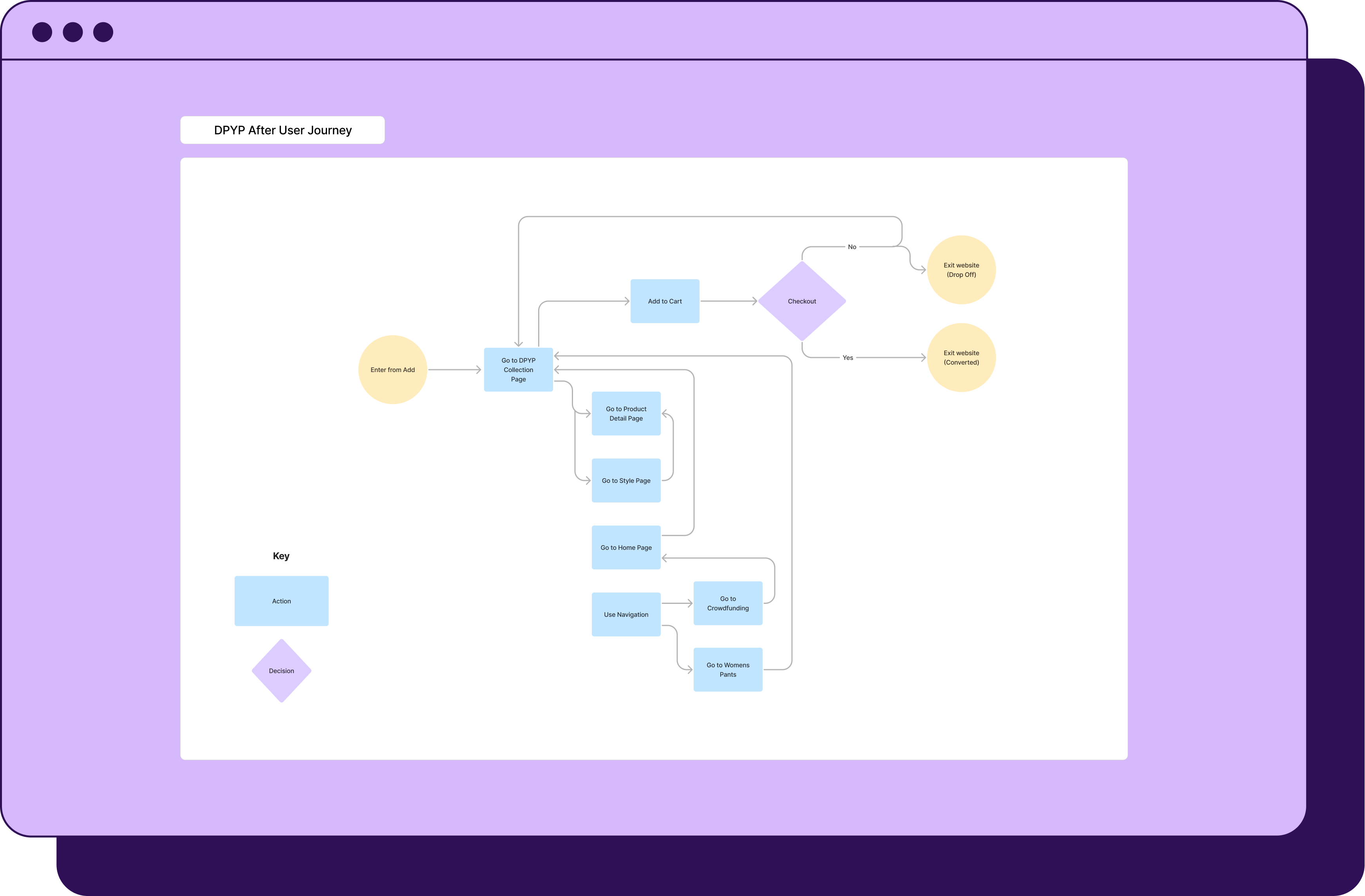
Before → After user journey:
Before: Ads → PDP → broken flows, missed products.
After: Ads → Collection → smoother discovery, higher-value purchases.
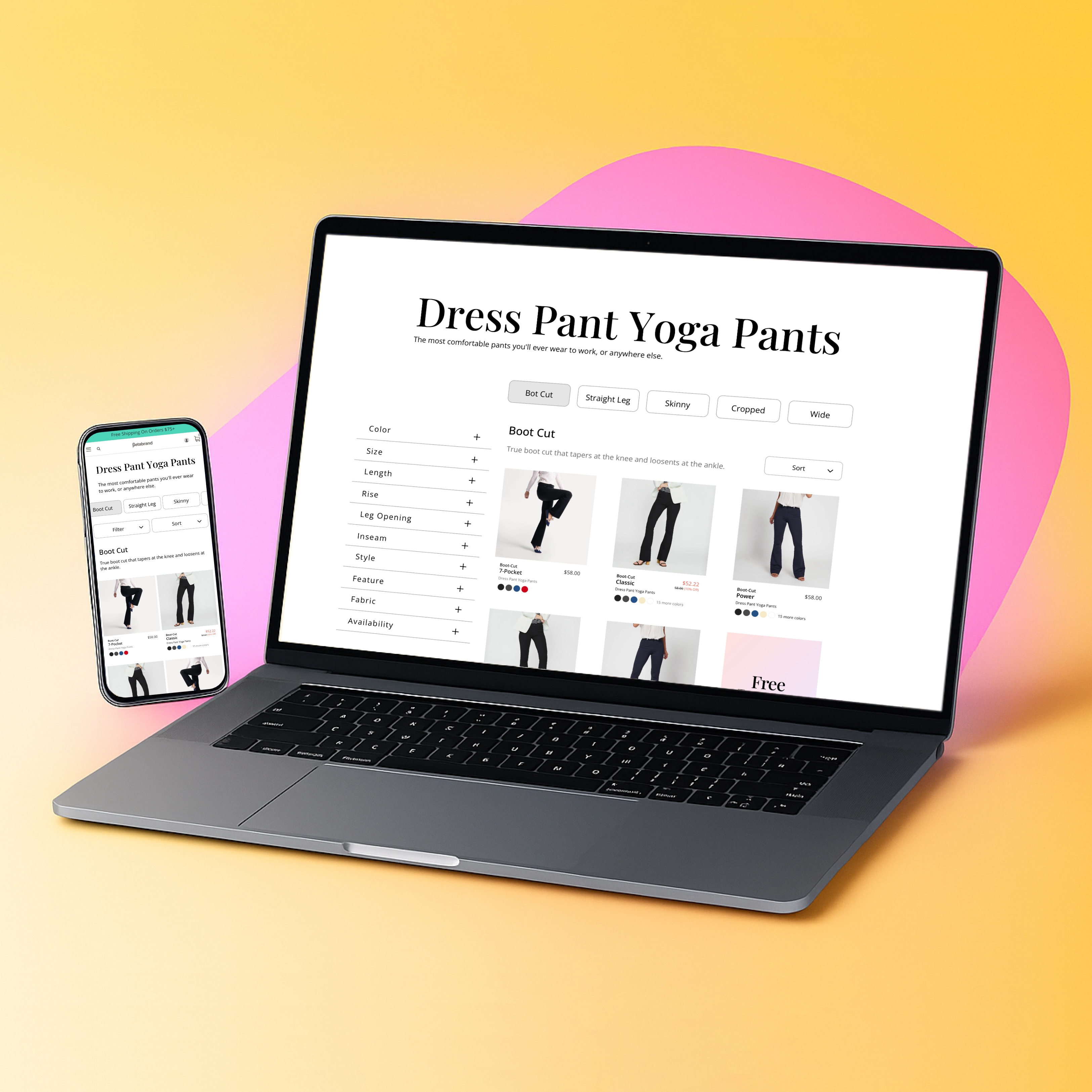
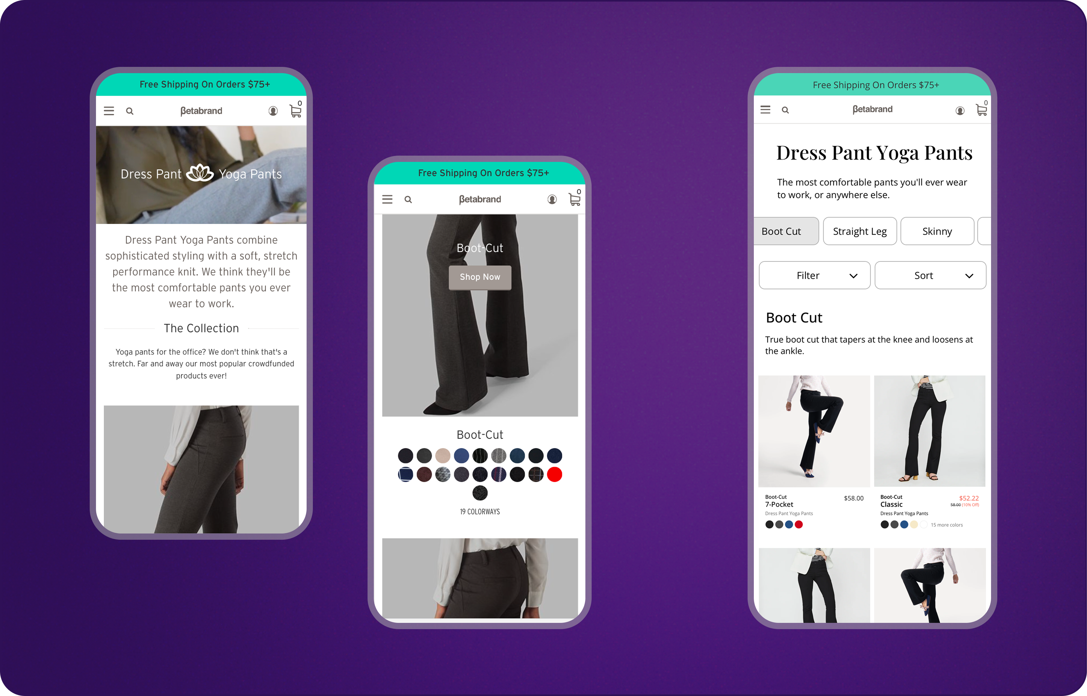
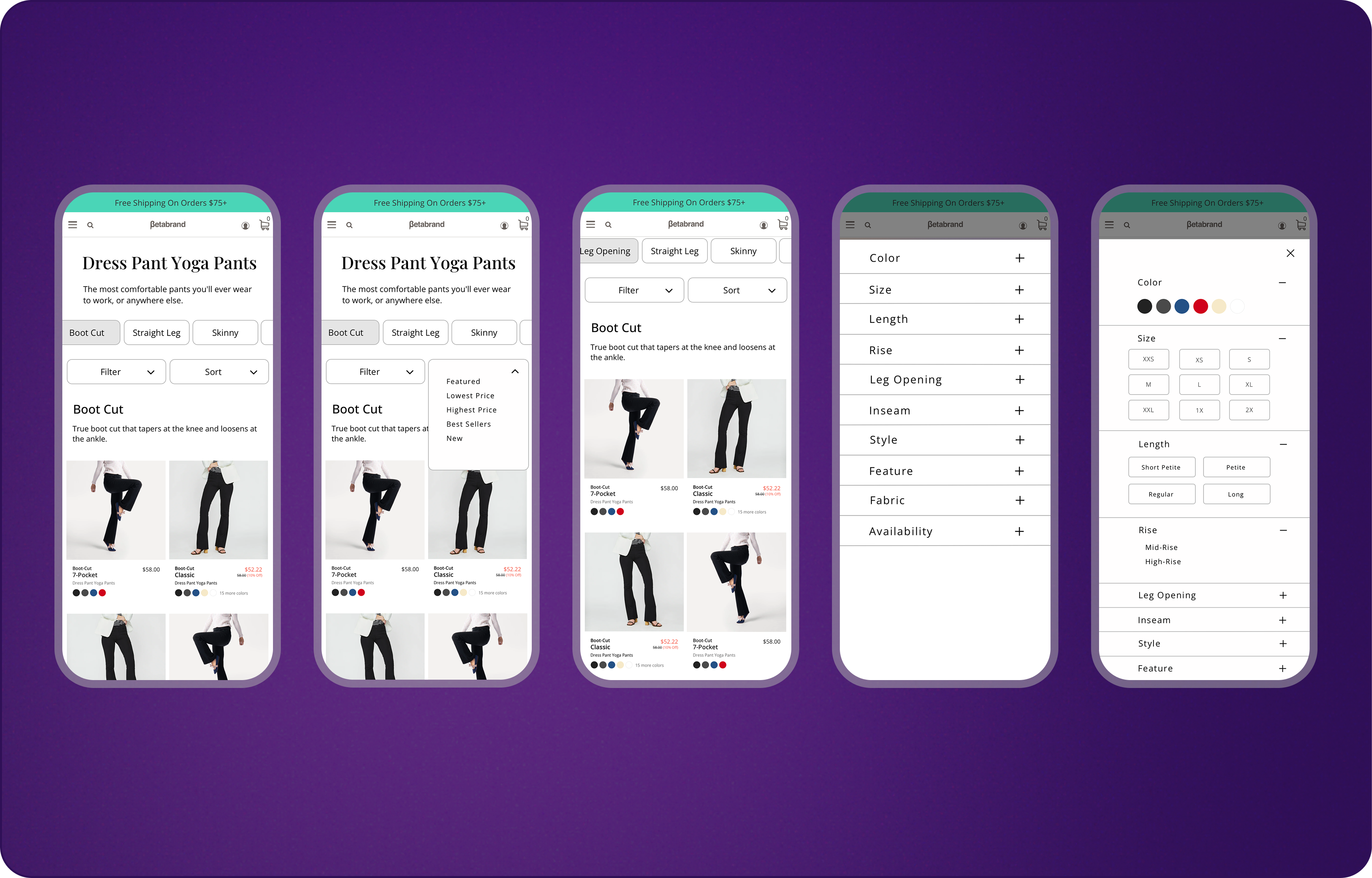
Before → After Redesign: DPYP Collection Page Mobile
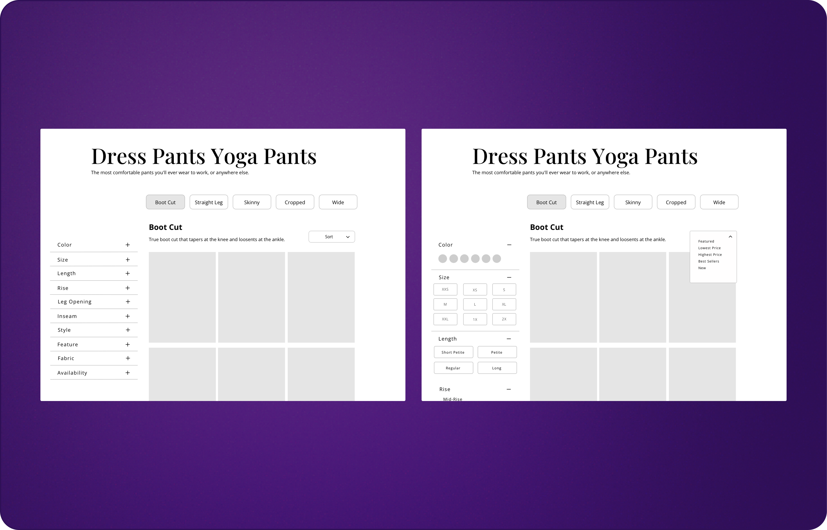
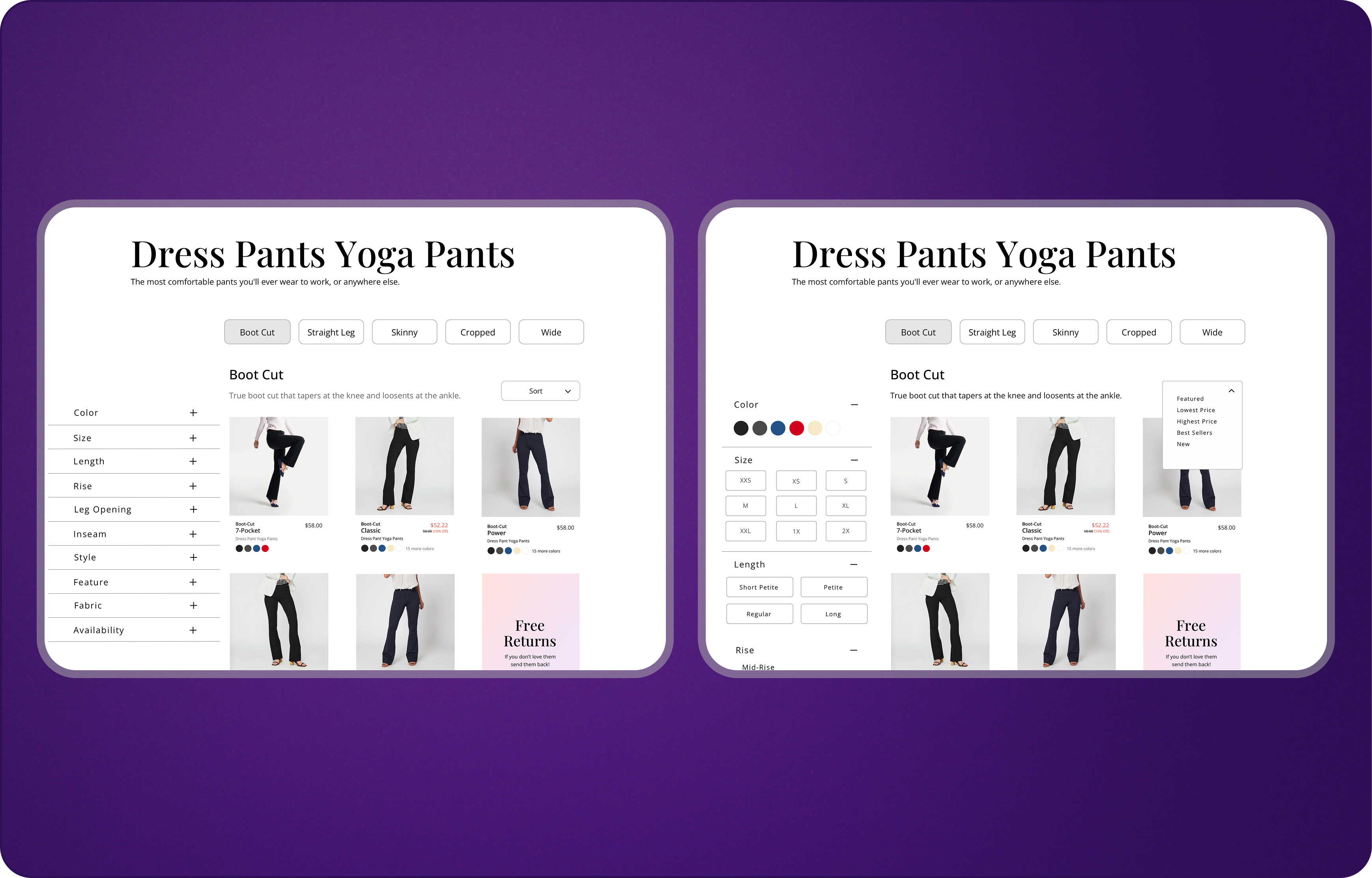
Before → After Redesign: DPYP Collection Page Desktop
Process & Solution
Through workshops and iterative design reviews, the team aligned on a strategy to improve discoverability:
- Reorganized the DPYP collection page to display the full assortment.
- Enhanced navigation, filters, and product cards.
- Redirected ad traffic to the collection page instead of isolated PDPs.
- Updated adjacent areas (homepage, women’s pants, PDPs) for consistency.
1. Past Data Analysis
I reviewed data from past research, User Diary Study/Ethnographic study, CS team insights, watched User Stories, reviewed past Optimizely experiment data.
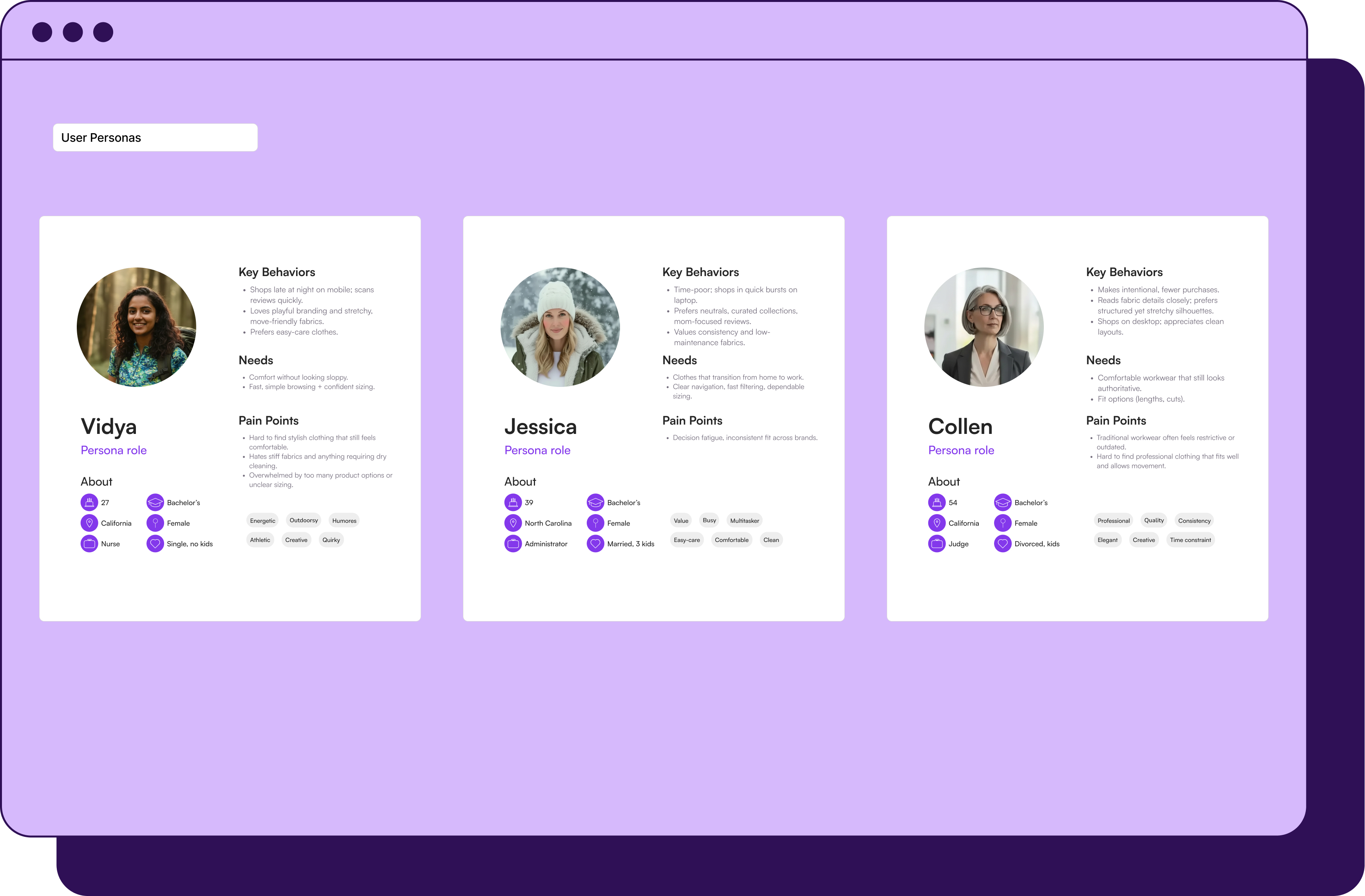
2. Reconfirmed User Personas
To ground our work in user needs, I reconfirmed and updated user personas.
3. Workshops & Insights
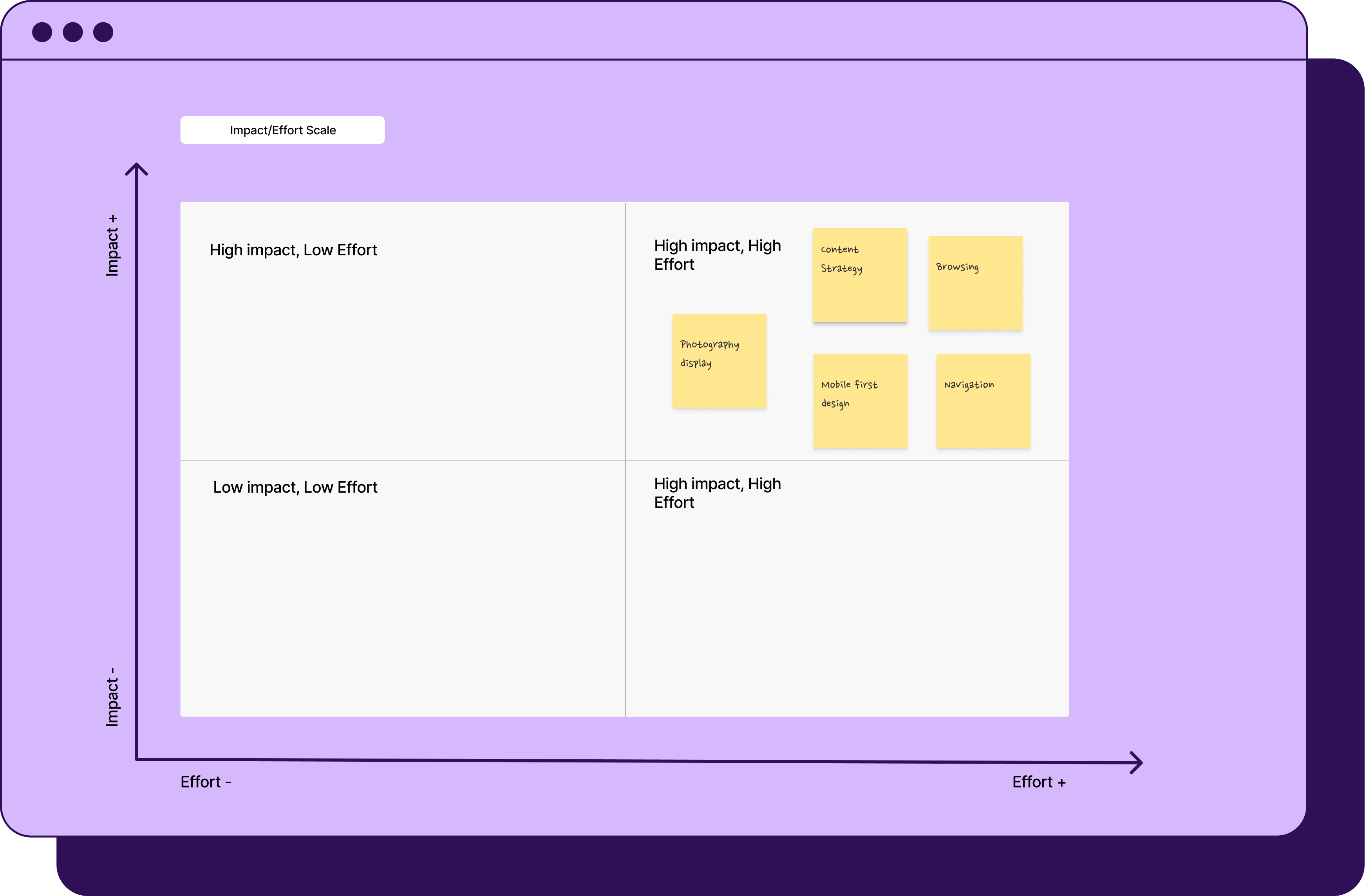
We started with a deep-dive design workshop. The methods used were divergence to convergence, dot voting, and impact vs. effort scale.
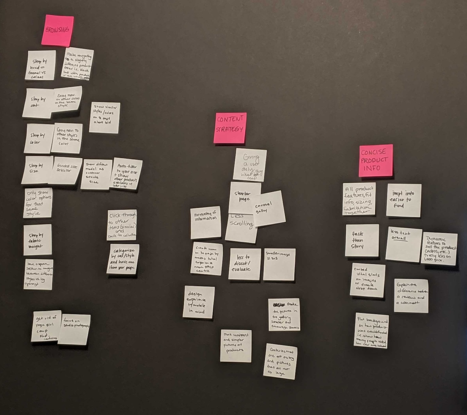

Each member voted on their top two solutions to improve the DPYP collection through the lens of discoverability.
Cross-team workshops identified top pain points: content overload and browsing complexity.
2. Research Validation
Community polling confirmed users’ top preferences: shopping by style and size.
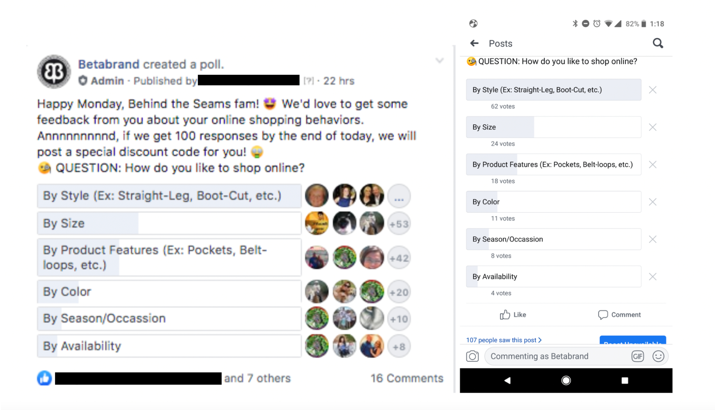
I then analyzed the first and second purchase data. The aim of this analysis was to establish what variety means to our users.
My findings were:
• For the cohort that first purchase was bootcut black variety means leg opening.
• For the cohort that first purchase was straight leg black variety means color.
The goal was to compare these findings to baseline with the new data after our changes were implemented.
3. Information Architecture
We restructured product taxonomy: style and fit first, then color and fabric. This aligned the collection with how users shop.
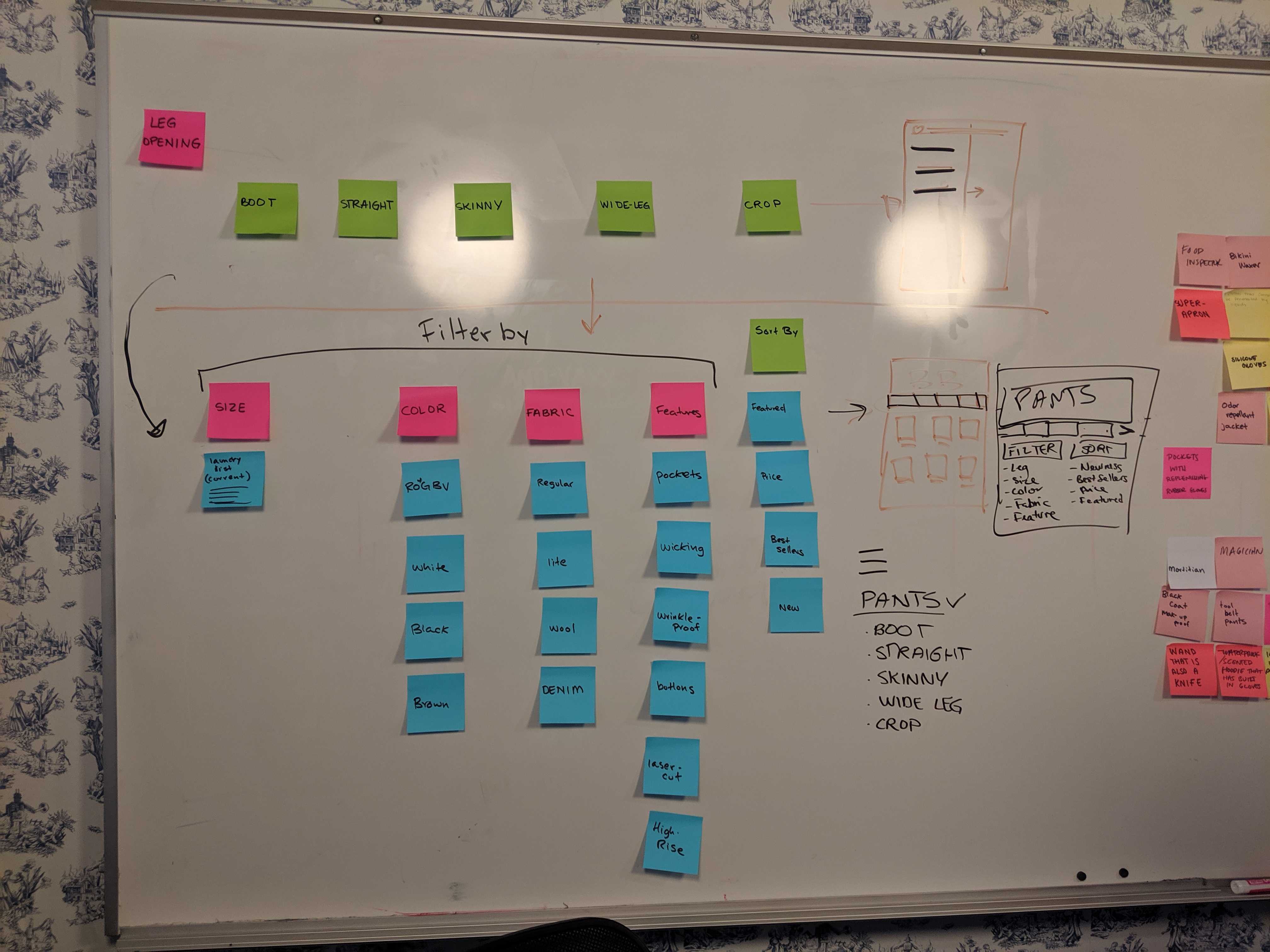
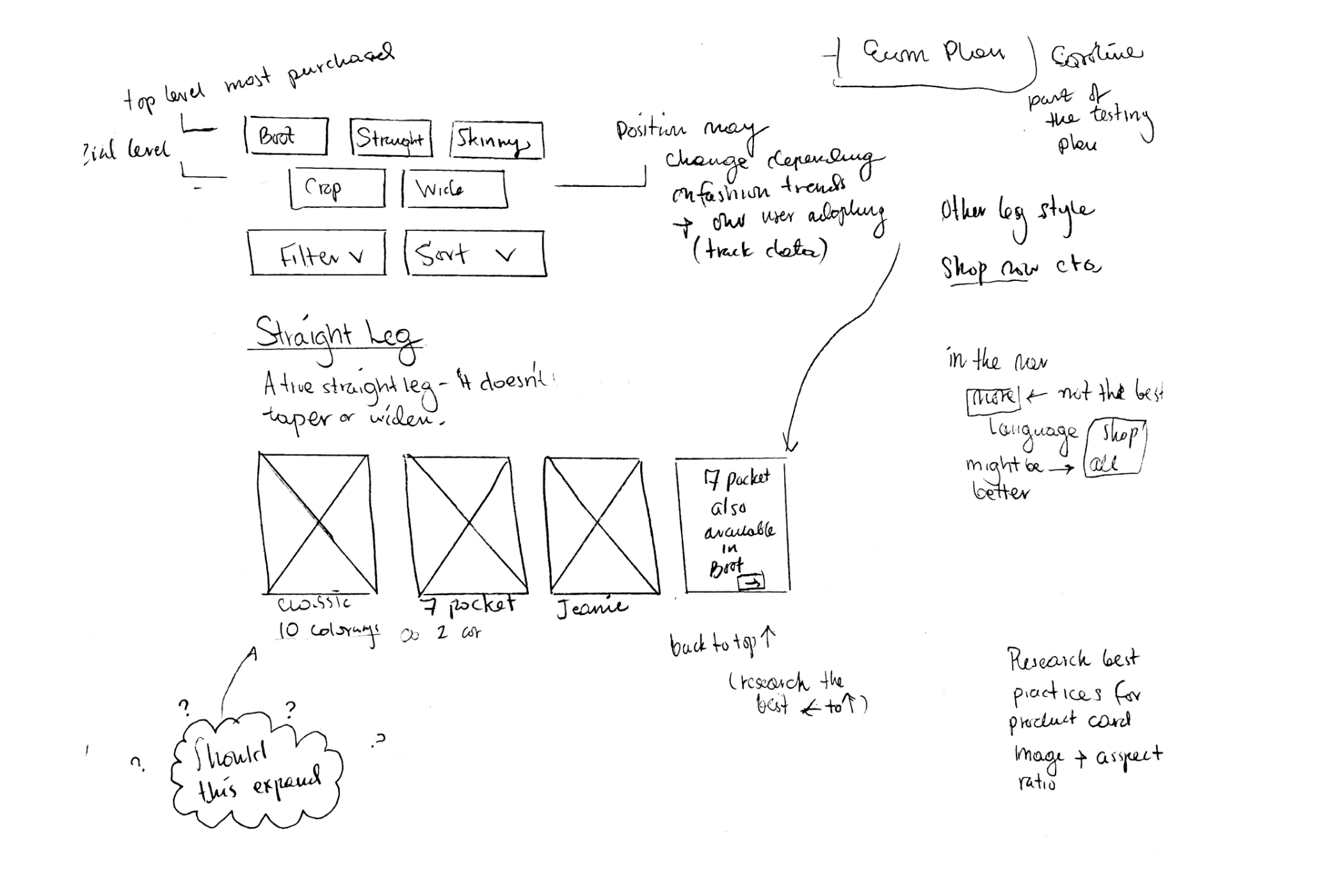
4. Wireframes
Early flows mapped how users would filter and browse across leg openings, sizes, and features.
Header, Filter + Sort (Mobile)
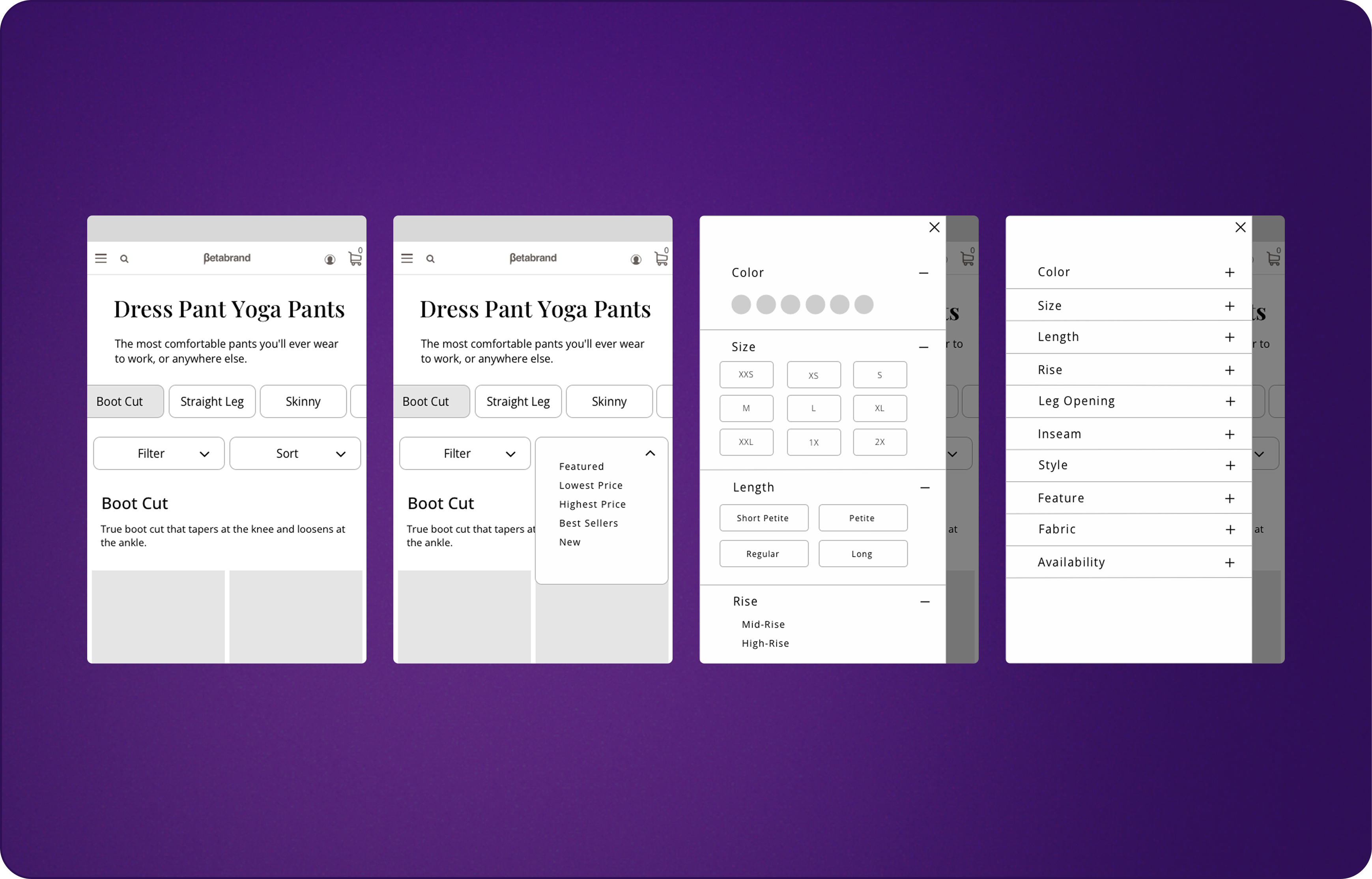
Header, Filter + Sort (Desktop)
5. Final Design
Header, Filter + Sort Prototypes (Mobile)
Header, Filter + Sort Prototypes (Desktop)
6. Implementation & A/B Testing
I assisted my Engineer teammate in implementing the new designs to ensure a speedy QA.
Phase one was focusing on MVP. We updated the header, and configuration of the the way the product cards were displayed on the collection page and ran an A/B test.
My engineering teammate and I set up several A/B tests in Optimizely.
A/B tests involved:
- Collection Page Header and Sections configurations
- Product Card test – for Call to Action (CTA) versus no CTA placement such as “shop now”
- Filters test – new filters vs old
- Updated Product cards
7. Reviewing the Data
Redirected ad traffic to the collection page, exposing users to the full assortment and encouraging multi-item purchases.
The AB test yielded positive results for the new configuration. Increase in add to cart, minor increase in conversion, increase in revenue events, and increase in more then one item in cart. It was extremely stressful waiting for results since this was the first project that did not just focus on conversion as its only KPI.
Results
The redesign delivered measurable business impact:
- +22.34% increase in add-to-cart rate.
- +7.76% lift in multi-item conversions.
- +$9 increase in average order value (AOV).
- +1.8% increase in revenue events.
Beyond conversions, the project expanded the customer base, increased LTV, and made advertising more efficient by driving higher-value, more varied purchases.
Why It Matters
This project not only optimized a hero product line but shifted Betabrand’s strategy from short-term conversions to long-term customer value.
Facilitating workshops proved pivotal — they gave marketing, merchandising, and engineering shared ownership in the solution, ensuring that business goals aligned with real user needs.
This Project Taught me How to Transform Fragmented Goals into a shared Strategy – Aligning teams Around Customer Value, not just conversion.
contact me
Fill in the form to contact me or send an email to kinga.rutynowski@gmail.com