LAT: Circura
MVP to Enterprise Solution: Streamlining B2B SaaS for Long-Term Care
client
Life Assist / Circura
role
UX UI Engineering / Design
Overview
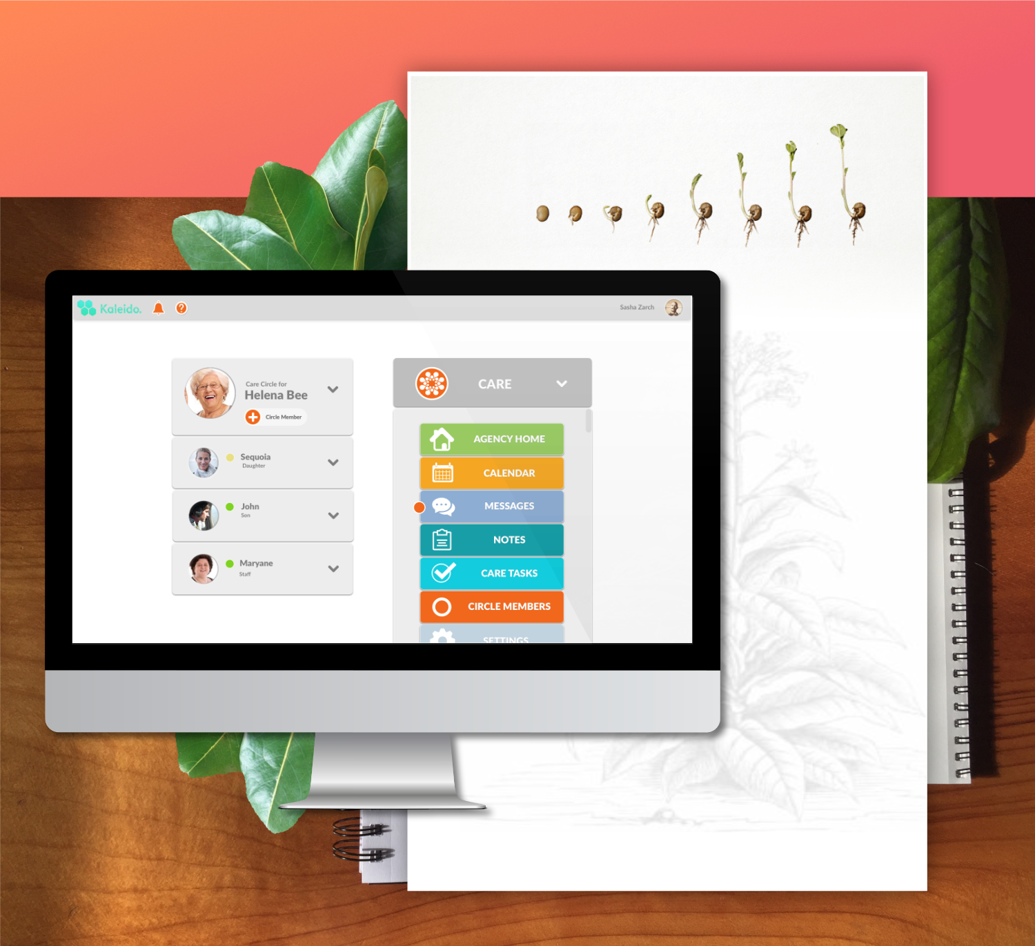
LifeAssist is an enterprise B2B SaaS platform that supports long-term care providers. The tool enables administrators, caregivers, and staff to coordinate tasks, manage patient information, and streamline communication in environments where efficiency and clarity are critical.
When I joined the project, the platform was functional but fragmented. Different modules lacked visual consistency, workflows were unnecessarily complex, and accessibility was not prioritized. For care providers already under pressure, this meant wasted time and increased friction.
The business objective was clear: redesign the platform to make it accessible, responsive, and standardized across all modules — ensuring that providers could focus on care, not navigating the software.
Challenge
When I joined the project, the platform was functional but fragmented. Different modules lacked visual consistency, workflows were unnecessarily complex, and accessibility was not prioritized. For care providers already under pressure, this meant wasted time and increased friction.
The business objective was clear: redesign the platform to make it accessible, responsive, and standardized across all modules — ensuring that providers could focus on care, not navigating the software.
- The platform was cluttered and inconsistent, with different visual styles across modules.
- Complex workflows created confusion and slowed down staff in high-stakes situations.
- Lack of accessibility and responsive design made it difficult to use across devices.
Objective
Redesign LifeAssist into a unified, user-friendly enterprise platform by:
- Streamlining user flows to reduce friction for care providers.
- Establishing a standardized design system to align all modules.
- Making the product accessible and responsive across devices.
MY Role
I worked as a UX Engineer / Product Designer. My responsibilities included:
- Conduct research and establish user peronas.
- Creating wireframes, user flows, and prototypes.
- Designing high-fidelity UIs for critical workflows.
- Establishing a standardized design language across the product.
- Partnering with engineering — contributing LESS styling code — to ensure designs were implemented accurately.
- Conducting QA to refine details before launch.
Outcome Overview
The redesign simplified the platform’s complexity, making it significantly easier for caregivers and administrators to complete daily tasks. Establishing a design system ensured consistency and scalability across the product, while accessibility improvements made the platform more inclusive.
The work improved efficiency and adoption, reduced training overhead, and strengthened collaboration between design and engineering.
Before & After
Before: Care providers navigated inconsistent flows across different modules, often repeating steps or losing track of key actions.
After: Redesigned user flows consolidated redundant steps, clarified navigation, and created a consistent experience across modules.
Process & Solution
- Redesigned dashboards for clarity and hierarchy.
- Standardized filters, navigation, and forms across modules.
Responsive layouts for tablet and desktop.
Accessible color palette and typography for readability.
1. Audit & Research
- Reviewed the existing platform to identify pain points and inconsistencies.
- Collaborated with care providers to understand critical workflows.
2. User Personas
- Created user personas.
3. Wireframes & Flows
- Created user flows for high-stakes tasks to identify redundancies.
- Designed wireframes to test simplified navigation.
4. Design System
- Established a standardized library of components, colors, and typography.
- Ensured accessibility guidelines were built into the system.
5. High-Fidelity UI & Prototyping
- Designed final screens for dashboards, task management, and communication features.
- Built clickable prototypes for usability feedback.
6. Engineering Collaboration & QA
- Contributed LESS styling to align design and code.
- Conducted QA sessions with engineering to refine details.
7. Post Surveys
- Conducted surveys to determine user satisfaction, adoption rate, and task speed.
Results
- Improved usability: streamlined flows reduced the number of clicks needed to complete key tasks.
- 30% reduction in average time to complete daily task logging
- 25% faster access to patient records (measured in clicks and screen transitions)
- Increased adoption: staff and family members reported higher satisfaction with the new workflows.
- 50% reduction in training time for new staff
- +45% improvement in family member portal usage
- 60% increase in timely responses to family inquiries
- 70% of staff reported improved collaboration across shifts (post-launch survey)
- 85% staff satisfaction rate in post-rollout survey (vs. 52% pre-redesign)
- Accessibility impact: color, contrast, and responsive adjustments enabled broader use across devices.
Reflection
This project taught me the value of bridging design and engineering to deliver scalable enterprise solutions. Establishing a design system early created a foundation that sped implementation and reduced rework.
contact me
Fill in the form to contact me or send an email to kinga.rutynowski@gmail.com